


There are times when a full-fledged chart in Excel is overkill and you just want to create a quick visual representation of your data.
For those times, here are three in-cell alternatives for using charts in Excel.
Use Sparklines to create graphic in-cell charts
Sparklines are great to give you (or your audience) the big picture quickly without the fuss of a full-fledged chart. There are three types of in-cell Sparkline charts you can create: Line, Column and Win/Loss.
To add one of these three Sparklines, go to the Insert tab and click the button for the Sparkline you want to use.
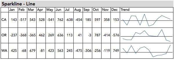
Sparkline Line Chart
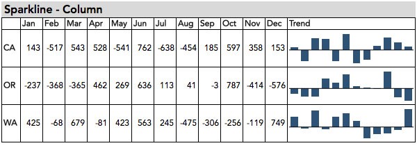
Sparkline Column Chart
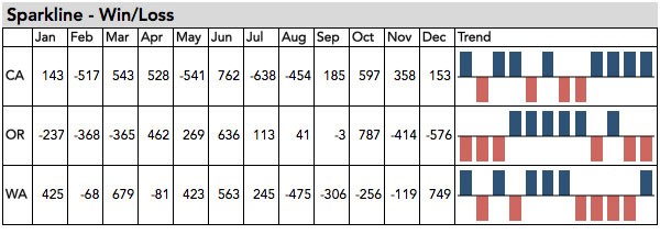
Sparkline Win/Loss Chart
Formatting Options to Consider
When formatting your Sparkline charts, consider the following formatting options.
- Adjust the width or height of the cells containing the Sparklines to tell your story better by giving more context to the scale being displayed
- Add markers to all of the data points, or just the high and low points
- Use an axis to display negative numbers
- Change the colors to match your document’s theme
Use Conditional Formatting Options to create in-cell charts
Conditional formatting is another quick in-cell alternative to creating a separate chart in Excel.
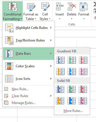
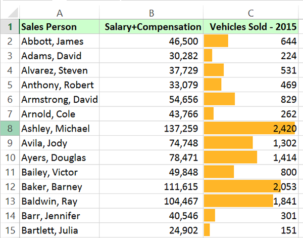
Simply select your data and then choose Conditional Formatting on the Home tab. Next, choose Data Bars > Solid Fill.
By default, the data that creates the bars will still be displayed in the cell (see screenshot below). Since you’re depicting the data visually, you may decide that you don’t need the numbers there at all.
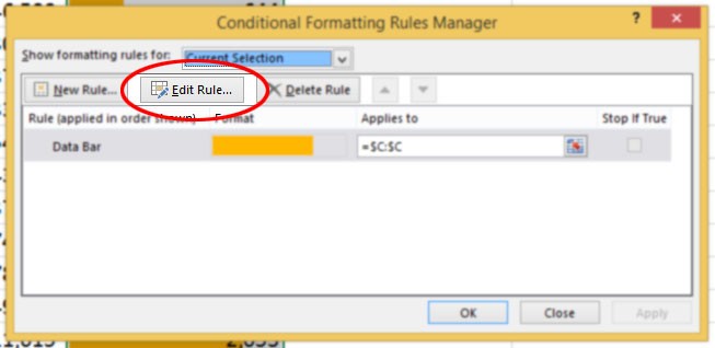
In that case, go back to the Conditional Formatting menu and choose Edit Rules…
Then click Edit Rules and check the box “Show Bar Only.”
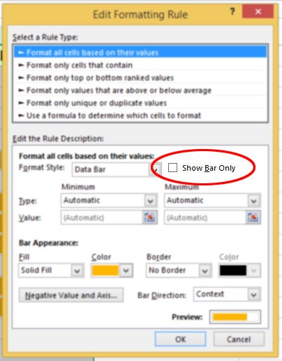
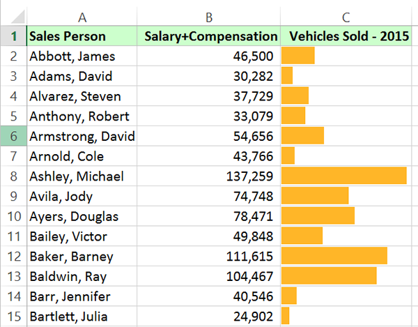
Once you click OK, the numbers will be hidden from view.
Use Symbols and the REPT function for in-cell charts
The third option presented here is to use the REPT or Repeat function as an alternative to charts in Excel.
The REPT function will repeat the same text or symbol for a specific number of times. Let’s say you have salary information in column D of your workbook and you want to visually represent it in column E.
In column E, you would type: =REPT(“$”,D2)
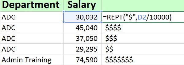
When you do this, for the value in D2, you will see a corresponding number of dollar signs in the corresponding cell in column E.
Bonus tip 1: if the number is too large, you can divide the value to make it smaller. For example, you could have =REPT(“$”,D2/10000), which will give you fewer dollar signs, but it will still give you a relative number for your data set to help you visualize your data.
Bonus tip 2: Instead of entering text as the first argument in the REPT function, you can insert a symbol from the Symbol menu on the Insert tab.
Want to master Microsoft Excel? Check out the Lynda.com series, Excel Tips Weekly.

Topics: Productivity tips
Related articles