


Imagine being able to add graphics to your web projects that can be controlled using JavaScript and CSS. Well, that fantasy is now becoming reality with SVG, short for Scalable Vector Graphics.
If you travel in web design and development circles, you may have noticed the chatter surrounding this acronym-named graphics format has reached fever pitch over the last year and a half, and for good reason. SVG is, in many ways, the Holy Grail of web graphics, combining standards-based cross-platform markup with modern web technologies to give designers, developers and even animators abilities they never dared dream of.
Before we can talk about SVGs, a short history lesson is in order:
The Best Tool for the Job
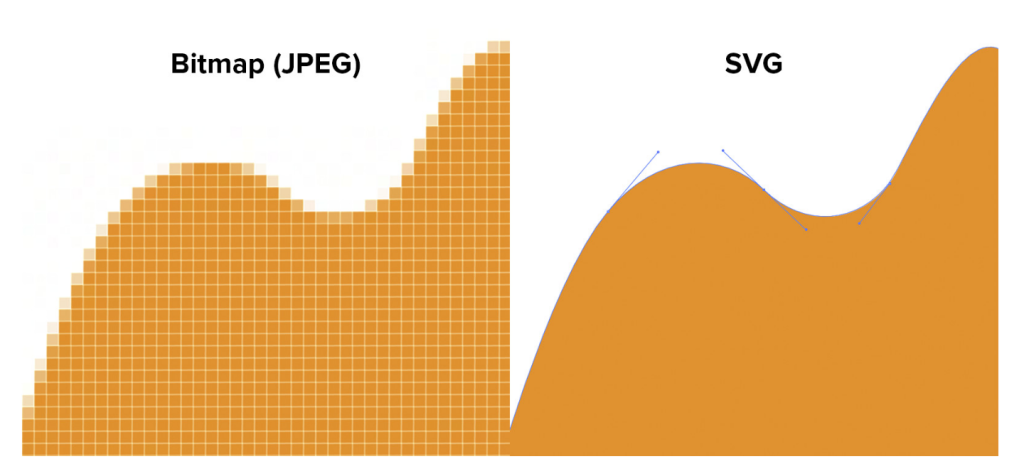
Traditional image formats like JPEG, PNG and GIF are all bitmaps. This means each pixel of the graphic is mapped out on a grid and “painted” in the browser when displayed. First pixel from the top right is blue, second pixel is a slightly lighter shade of blue, etc.
Bitmaps are excellent for displaying complex graphics with a lot of colors (JPEG), and can also be used to display graphics with complex alpha (transparency) layers (PNG). A simple photograph of a blue sky can have millions of shades of blue that all need to be rendered accurately to create a realistic experience. This is what the bitmap image formats, and in particular JPEG, are made to do, and their prevalence have ensured continued technological advancements that have made all of them fast, efficient and universally accepted.
But no convenience comes without drawbacks. Bitmaps are literal maps of bits, causing them to have a fixed size. That means when they are displayed in a frame that is either smaller or larger than this size, we either lose valuable pixels (and waste bandwidth in the process), force the browser to increase pixel size or guess at what should be displayed (causing blurry images).
So, while they are great for displaying images in a controlled environment like a printed photo, digital frame, or a slide deck, they are a sub-optimal solution when it comes to displaying graphics in a dynamic environment like a web browser.
This became a significant issue when high resolution displays started appearing on mobile devices and computers: Graphics that used to look crisp and clear suddenly appeared blurry, and this was especially noticeable on computer generated graphics like icons and logos. For example, when the first “Retina” screen iPhone came out, users immediately started complaining about out of focus or blurry graphics.
Before the (re)introduction of SVG (the format is actually a relic of the early web, first introduced in 1999), designers and developers solved the “retina problem” in one of two ways: either serving up massively oversized images that were squished down into smaller frames to increase pixel density on high resolution displays, or using icon fonts to display logos and icons. Both of these approaches were stop-gap measures while we waited for better technologies.
For high-resolution images, we are starting to see better solutions like RICG responsive images, progressive JPEGs, and new formats like WebP. For computer generated graphics, we now have SVG.
Here are five reasons why:
1. Scalable. Vector. Graphics.
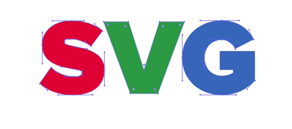
The first, and most obvious, reason SVGs are gaining so much traction is in plain view in the name: SVGs are scalable vector graphics, making them fundamentally different from the other graphics and image formats we are accustomed to on the web.
Rather than a map of bits, an SVG is a series of code-based instructions on how to draw lines and graphs that are interpreted by the browser on the fly when they are displayed. So rather than telling the browser “here is a grid, 100px by 100px, and the colors of the icons are as follows, counting from the top right corner”, the SVG says, “I want you to draw a rectangle / circle / polygon / graph with the following dimensions. Please scale it to fit the proportions of the current displayed area, and apply the following stroke width, style and color as well as the following fill.”
For illustrators, the difference between bitmaps and SVG is the difference between working in Photoshop and Illustrator: in Photoshop you manipulate pixels, in Illustrator you manipulate vectors.
Because SVGs are codified instructions on how to draw a graphic, the browser can draw them at any size and any resolution, and because the lines are drawn on the fly, they are always crisp and clear.
2. Versatility
At its core, an SVG is still “just” a regular image format, and as such it can be used in the ways we normally use images on the web. SVGs can be displayed as-is inside <img> elements, and as background images in CSS. When used like this, the graphics will show up as they were originally designed with the benefit that they are fully scalable.
In return, we get crisp and clear graphics across all screen sizes and resolutions that work and behave like the other image formats we are used to.
But this strips the SVG of what makes it unique: because SVGs are code-based graphics that use standard XML markup, they can be placed verbatim inline right inside any HTML document. And when the SVG is inline, it and its various elements become part of the Document Object Model, meaning it is a first-order citizen of the browser.
As you’ll see next, that opens the door to a whole new world of possibilities.
3. Styling and symbols
SVG is an XML-based vector image format where each graph or object is defined individually. This means each graph or object is an element in the browser DOM (Document Object Model) and we can treat it just like we treat any other element.
In particular, SVG elements can be styled using CSS, meaning you can use a stylesheet to change each stroke and each fill the same way you would apply CSS to any other element in a web document.
Want to make the stroke thicker or thinner? Define the stroke-width. Fill a circle with a new color? Change its fill.
It doesn’t end there. Most CSS properties can be applied to individual elements within an SVG, giving you the ability to control how an image is displayed. This means you no longer have to make multiple versions of a logo, one black and white, one grey and white, one duo color, one multi-color, etc – you just use the same SVG and apply a different CSS, depending on what you need.
And that’s not all!
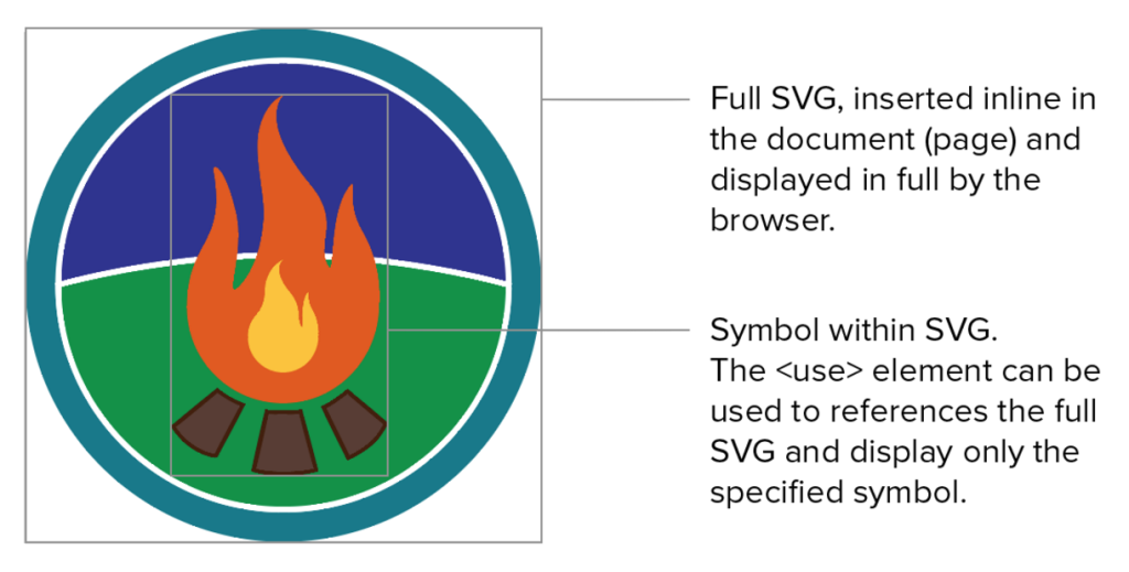
Because each element within an SVG is drawn individually, we can use the <symbol> element within the SVG to identify individual components of the graphic and call them in where we need them.
As an example, you can add an SVG header graphic to your page that defines the logo, the ring around the logo, and the stylized text next to it as individual symbols. Then, later on in the document, you can display just the logo, just the ring, just the text, or any combination you want at any time, by calling that symbol a second time via the <use> element.
This element finds the existing SVG in the document and repeats the display of the specified symbol later on in what’s called the “Shadow DOM”. Add one SVG, use its symbols as many times as you like!
4. Animation through CSS and JavaScript
You think that’s impressive? Well, we’re just getting started. Using modern CSS and JavaScript, we can change the behavior of SVGs and their individual components in the browser!
Does your logo have a wheel in it you want to show spinning? Apply the CSS animate property to that component, and the browser does the rest for you.
In fact, manipulating SVGs with CSS transforms, transitions and animations can create truly impressive animations that were previously only possible in video format, all natively in the browser.
Also, because SVGs are code-based definitions of points and curves, using JavaScript allows you to manipulate the actual paths of each individual element within the SVG, changing its appearance completely. Think real-time animation in the web browser and you start to see the tip of this iceberg.
5. Performance and accessibility
SVGs have other more major benefits over other graphic formats, including performance and accessibility. As I explained earlier, an SVG is a set of instructions for the browser on how to draw a graphic rather than a pixel-by-pixel map of that graphic. That means in most cases the SVG carries far less information than an equivalent bitmap which automatically improves performance.
In addition, SVGs can be subjected to the same code optimization processes we already use for HTML, CSS and JavaScript, including minification and compression, resulting in drastically reduced file sizes. Tools like SVGO (and its web-based GUI SVGOMG) make quick work of this process and can easily reduce the size of an SVG file by 30 to 60 percent or more, without changing its appearance.
Web accessibility has always been an issue, especially when it comes to images, and the web community is finally starting to take universal access to content seriously. SVG can have an important role to play in this process for a couple of reasons: first off, if you use web-safe fonts (or web fonts included in the currently displayed view), an SVG can hold true text elements that are accessible to viewers and screen readers alike.
Second, as web documents, we can attach aria roles, titles, and descriptions to individual SVGs providing context, titles and long descriptions to accompany our graphics.
SVG is ready for production
While the SVG has been around since the late 1990s, it is only finding its rightful place in web design and development, and that might be a good thing. What makes SVG such a powerful tool and the new North Star for interactive graphics on the web is the advancement of modern web technologies like CSS and JavaScript.
SVG is the right tool, coming full bloom at the right time. The only thing missing is you.
So is SVG ready for production? Some will say “no”, citing the lack of backwards compatibility in older browsers. I disagree.
With JavaScript shims like SVGInjector and SVG4Everybody, and full-fledged deployment tools like Grunticon providing PNG and other fallbacks for older browsers, SVG is safe to use in production today. True, browser implementation can be rough around the edges, and some features have yet to be properly implemented across the board, but that should not stop you.
In fact, it should encourage you to use them today. The cowpaths of the web are paved because we use them, and now is the time for you to put some scalable vectors in your graphics.
To learn how to implement SVG in your design and development process today, check out Hendriksen’s course Web Icons with SVG on Lynda.com.

Topics: Productivity tips
Related articles