

How I Designed The Black Panther Logo

1998.
The creators of the successful independent comic series ASH — Joe Quesada, Jimmy Palmiotti and Nanci Dakesian — had become editors at Marvel Comics. They were given a bunch of second-tier titles like Daredevil, Black Widow, the Inhumans, Ghost Rider and Black Panther, to reimagine as the "Marvel Knights" — a loose-knit team of street-level superheroes who could go on more "mature" & gritty adventures than the brightly-clad Avengers, FF and Spidey.
Over the previous few years, our team at Comicraft had become the in-house-though-out-of-town graphics department for Marvel, lettering most of their comics, as well as designing letters pages, book collections and dozens of logos. I'd worked closely with Joe and Jimmy on their successful relaunch of Daredevil with Kevin Smith earlier that year (another one of my logos that's had a second life onscreen!) so when it came time to brand the Marvel Knights titles, they gave me a call.
The Panther was moving from the jungles of Wakanda to the streets of New York City... and as soon as I heard "streets," well, I started sketching graffiti logos. I was obsessed with it at the time, and attempted to apply it to pretty much every logo I designed. There weren't many takers... but the letters sure are fun to draw!
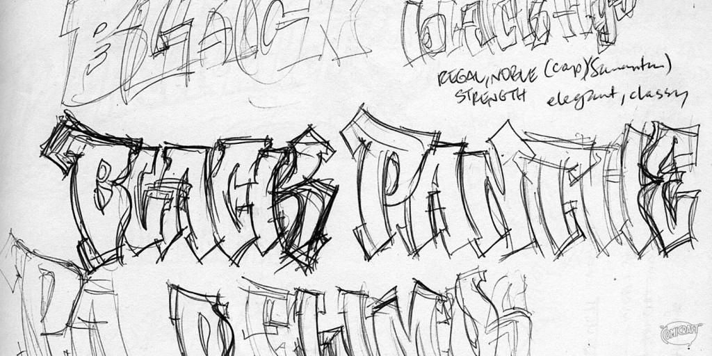
I also sketched out an idea where the logo formed the shape of a leaping panther, with spiky pointed ends that mimicked his claws and necklace.
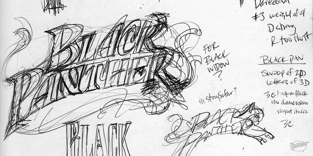
After re-creating the letter shapes in Illustrator, I applied a variety of outlines, curvy swoops and shadow effects, kind of like the Daredevil logo in reverse.
But they wanted something stronger and more heroic for Panther. T'Challa was the most high-minded and noble of the Knights -- their Captain America, Superman, or Samaritan from Astro City -- and this lettering was a bit too delicate. Next to my sketch above, you can see I noted that Joe said it might work for Black Widow, though we ended up going in a different direction for that, too.
Next I created this, which I thought was a bold combo of tribal and futuristic, with a superheroic lean back and 3D extrusion.
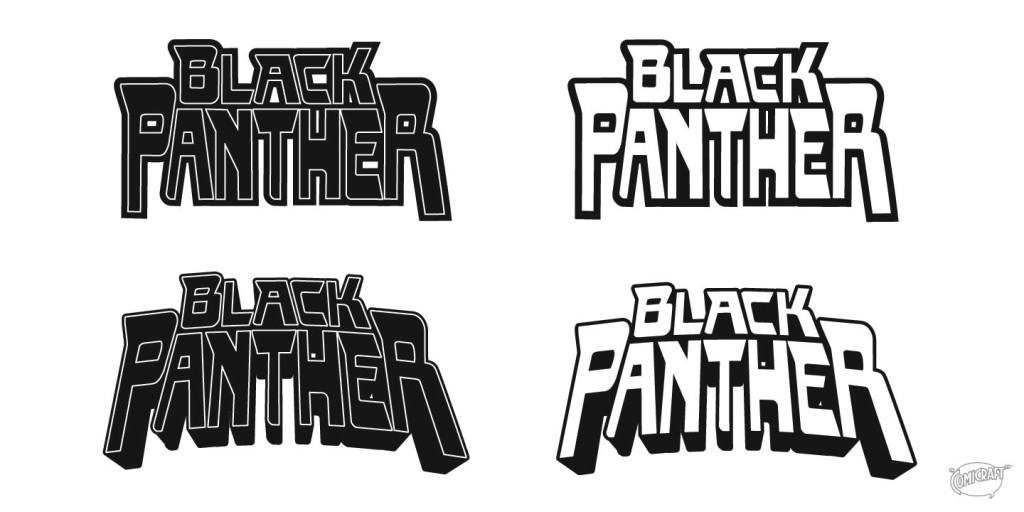
Joe thought the letters were too fussy, but he liked the way the words were arranged, with the emphasis on PANTHER and the taller P and R. He urged me to go in a classier, more typographic direction (that still had edge and aggression) and mentioned Tom Orzechowski's Wolverine logo as an example.
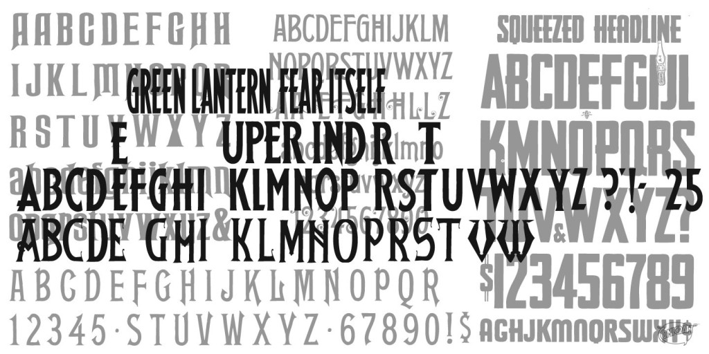
As a type designer, I keep folders full of partially completed alphabets. I found a file where I'd extrapolated most of an alphabet from the Wolverine letters, and combined them with some Victorian and Art Deco type catalog samples to create a Green Lantern mini-series logo. They chose a different one, but no vectors should ever go to waste!
I combined and arranged and tweaked those letters to match the shape of my previous logo, and applied a bunch of outline effects, drop shadows and the good ol' heroic lean and swoop.
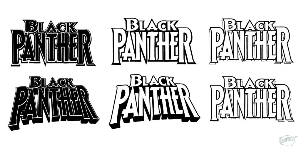
Joe thought we were on the right track, but asked for a version where BLACK was fully contained within PANTHER, for a more compact shape.
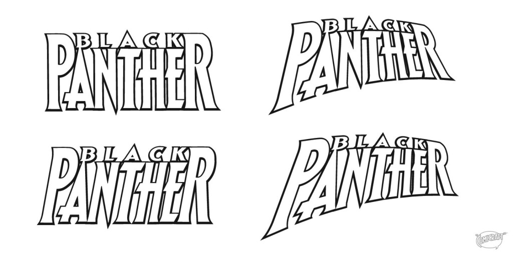
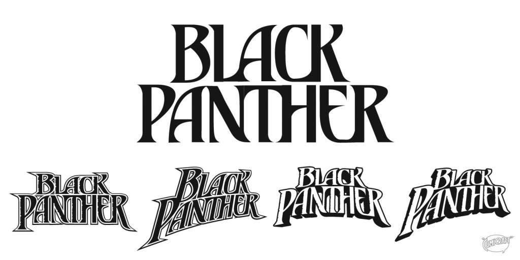
In the end, they went back to this one, with a few tweaks. And there it is: bold, classy and heroic with edge!
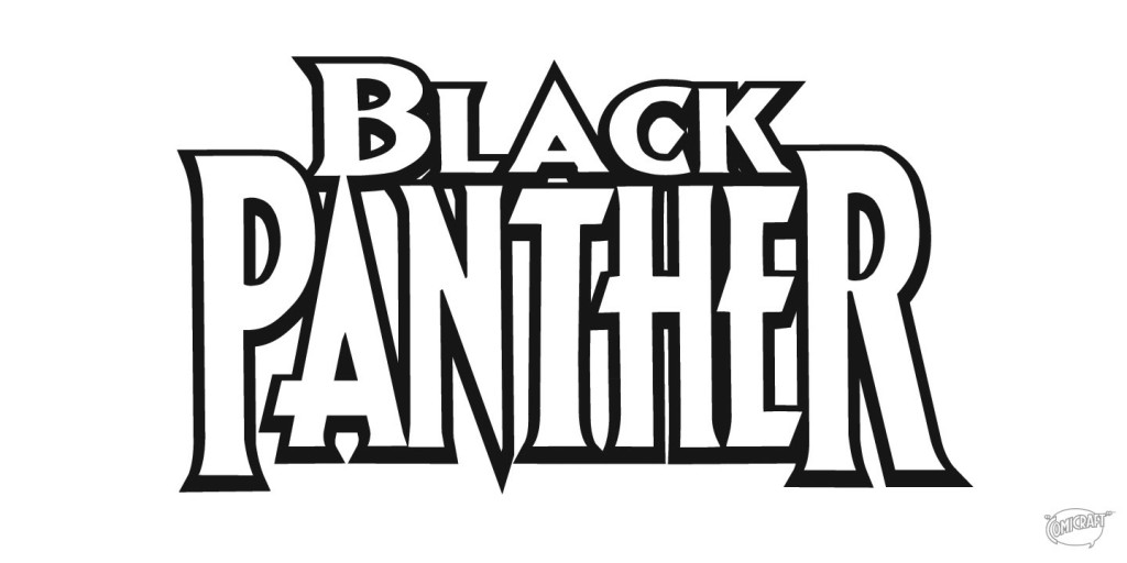
My logo was used for 49 issues of the Black Panther comic, and then changed (to something more "gritty and street," of all things) when a different creative team took over. I'd more or less forgotten about it... until 18 years later, when this appeared in the announcement for the Black Panther movie:
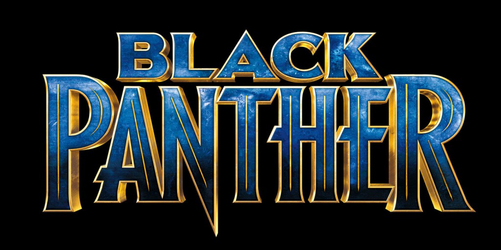
I thought the rendering looked beautiful, and I'm thrilled that that, of all the Black Panther logos throughout the history of the comic, mine was chosen to represent such an amazingly creative and cool movie, and will be forever associated with it. Now if they could just send me one made out of Vibranium... Shuri?
Want to learn more? Check out one of these LinkedIn Learning courses today:
- Lettering Comic Books with Illustrator
- Creating a Font for Apps and Games with Glyphs
- Learning Logo Design
- Design a Comic Book
- Drawing Foundations: Fundamentals

Topics: Productivity tips
Related articles