


Microsoft Office 2019 just released. And that means Microsoft Excel 2019 just released too, filled of new features and upgrades.
The question is, what are the features in Excel 2019 you should learn first? What are the ones that’ll really help you do your job better?
There are three that jump off the page. And, for those of you who have Microsoft 365 – don’t worry, all these features exist in Excel 365 as well.
The three most useful new features in Excel 2019 are:
1. Data visualization with Insights
This is a simplified generalization, but it’s a safe bet that there are two kinds of Excel people: those who know what kind of data they are looking for, and the best chart to visualize it with… and then there are the rest of us. We know what we’d like to see, but don’t quite know how to get there.
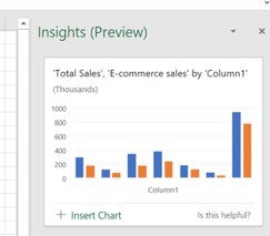
Enter Insights, a new feature on the Ribbon that will make lots of suggestions of great visual ways to see your data. Some you may have thought of, some will probably be new ideas.
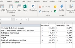
To use Insights, make sure you’ve at least clicked on a cell in an existing range of data, and then select Insert à Insights.
It will open up a task pane on the right-hand side with some new visual representation about your data. You can click the plus sign below each suggestion to use it in your Excel file.
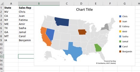
2. Funnel and 2D map charts
A funnel chart is a type of chart commonly used to illustrate the states in a process. For example, if you wanted to see the amount of closed sales versus the total amount of leads that were followed, you could use a funnel chart to visualize this.
Any process that has a 100% value and has some potential dropoff points along the way is a great candidate for a funnel chart. Excel now supports the funnel chart type, as well as a map chart of geographic data.
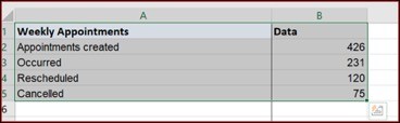
To use a funnel chart, your data should be arranged so you have at least one column for the possible stages in your process, and a second column for values.
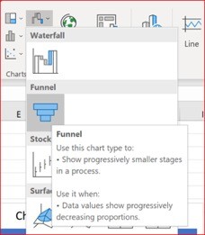
Click Insert à Waterfall, Funnel, Stock, Surface or Radar Chart and choose Funnel.
To use a map chart, make sure you have geographic data filled and click Insert à Maps à Filled Map (The first time you do this you’ll have to accept Bing’s data alert).
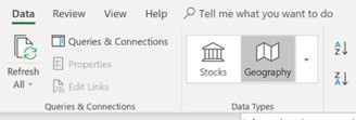
3. Geographic and stock data.
I’ve saved the best for last, the one that folks are really excited for.
Microsoft has been ramping up the AI-enabled engines, and the latest addition is available now. There is no end to the amount of data that’s out there, on the Internet, ready to be accessed. Sure, we can look up data manually, and up until now, that’s what we’ve done.
But now? We can now stop wasting precious time using Google searches on readily available data and let Excel pull in the information for us. Right now, this functionality exists for stock and geographic data, but there’s no reason to doubt that won’t increase to more data lookups in the future.
To use these lookups, make sure your column contains either geographical data or company names. Select the data, and then click Data à Stocks or Geography.
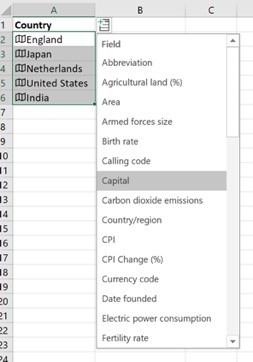
From there, you can click a small icon and choose from a long list of available data fields to add to the next column. These are some options for the Geography choice. For stocks, you’ll see all sorts of data about each company.
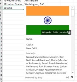
Finally, you can click the small icon to the left of the cell and get a Bing lookup of some facts about that region, such as a Wikipedia lookup.
Want to learn more? Watch the course Excel 2019 Essential Training.
Other courses you might be interested in are:
- Excel Quick Tips
- Office 365 New Features
- Excel Essential Training (Office 365)
- Excel 2019 for Mac Essential Training
- Office 2019 New Features

Topics: Productivity tips
Related articles